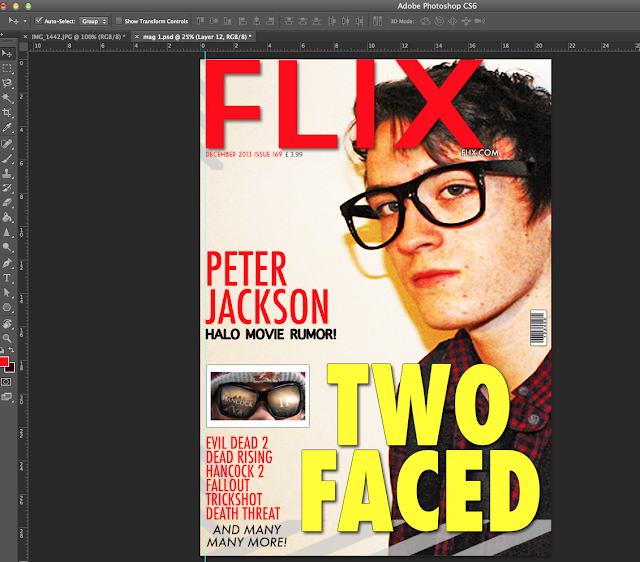
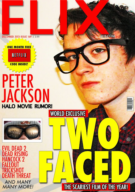
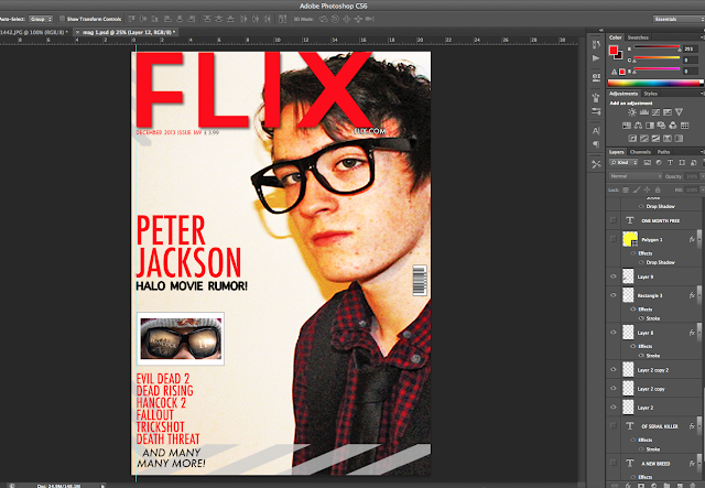
In this blog it will be a window into how i made this magazine cover from scratch with tool used in the program photoshop in the next paragraph below we will begin.
For this magazine cover i started off with a basic image of a friend that i took in front of a white screen and then adjusted the brightness and contrast setting and the shadows and highlight features and then added a sharper filter.
Original Image
Brightness & Contrast
Shadows & Highlights
Final Image
The final image was positioned differently to give the model a more wider appearance rather then just facial features to make the magazine look professional adding a colour balance effect to bring the face out more for the model to seem more vibrant.
Next was to add the title of the magazine to the picture to do this i used the text tool and added the name of the magazine which is called "FLIX" as for the film slang term movie flick.
with adding the text i used the layer style tool and added a drop shadow to the text to make it come off the screen i also made the text red to make it jump out to the viewer.
Below is the title added to the magazine
Next to add was the borders or images around the magazine these were added in different positions on the magazine to give it the intended media feel. what i mean by this is when the movie director says action the striped mark device is used so the stripes represent media.
below is the border result with the image.
Now that the borders were added to the cover it was now time to add more text for example more information about up coming movies to do this again i used the text tool again and wrote tiles for movies that are similar to this one and upcoming made up movies i added these titles in a list format.
below is the added movie titles.
After this text was added it was now time to add information about the magazine such as price,website name ,issue number and sub headline to do this i used the text tool again and changed and varied the colours to compliment the magazine so they appear on screen well and so they can be seen.
Below is the image of more text and information.
The Peter jackson headline would grab the readers attention as he is a huge director in the media industry so i made the text of his article bigger and the headline smaller to give the reader a reason to read this magazine.
Once the text was added i then added two images of importance to the magazine one being a teaser image of an upcoming film the other being a barcode for the magazine so it could be scanned.
The two images below were both used and below them is the magazine used with both images.
The final things to add was the main attraction of the magazine which is the movie in which the person on the cover is in.
In this case the movie is called Two Faced to make the text stand out i used the text tool and made it bolder and used a more vibrant colour in this case yellow with a stroke effect to make the text stand out more which can be accessed in the layer style options on the layers tab.

To make the title look more realistic i used the shape tool to make two small red rectangles with text inside of them above and below the magazine to make it look more like a magazine below is the finished title.
The one final touch was to add an offer this is seen in pretty much every magazine ever made this is so the reader gets something out of it then just articles they get something out of the magazine this is a marketing technique that always works. To do this i used the shape tool to make a polygon object and then added text inside of it with also a jpeg image of the popular company net flixs below is the final finished product which can be seen also above at the start of this blog.

This is the finished product.


No comments:
Post a Comment