In this blog i will be looking at FLIX a magazine cover made by me and will be evaluating it to other actual magazines to and will grade it fairly on how it looks to that of an official media magazine.Furthermore i will be looking specific fields of the magazine this will be the production,sources of information,finished product and its effectiveness.
The starting production of this magazine started with a figure posing for a picture however this dose not mean using phones and posting them on the web. A professional camera was used in a room with a blank white wall i told the figure how and where to stand and the photo was then taken and uploaded where it would be edited using Adobe Photoshop.
Editing this photo started by changing the brightness and contrast of the image to make it a more visible image and so that it would come of the canvas as so many other magazine covers do. Next using colour balance was use to lighten the mid tones and darken certain areas with the shadows. There was a part of me that wanted to texture the figure.
However i thought this would make the image look to fake and therefore went with using the Sharpen filter to make it look more realistic. Finally the shadows and highlights tool was used to make the image come out more to the audience also to make it look professionally done by a photographer.
Once this image was finished next was the name of the magazine i decided to use FLIX as it links in with the common slang "movie-flick" so that was the idea behind the name using a custom font the title is "blocky" text and comes off the screen well and makes it look genuine.
Once the title was implemented other text had to come next a basic font was used on the smaller text such as the pricing and information about the magazine the more unappealing side of the magazine.
However other text like the headlines,sub headlines and movies were typed with another custom font to link with the theme of a "blocky" text that comes of the magazine finally one of the sections of fonts was put into italics a clever way to change the feel of the magazine and leaving the reader wanting more.
Moving a way from text it was now a time to focus on a border for the magazine i decide to use diagonal stripes to be used as it links with "Clapper Board" these are used in takes of movies however with two sets of vertical stripes made it look like a cliche so one set was taken from the image.
The first set of stripes still made the image look armature at best so the stripes were moved and deleted in certain spots so not interfere with the other images. On the other hand a shape tool was used to make the offer logo for the net-flix code offering this is used as a selling technique and pushes the offer to the reader as they get something from the magazine. Shapes were also used as background images for some text to bring it off the page the same is done for specific images.
Lastly the images were found on the internet and were cropped and put into certain areas to make it fit with the theme of a movie magazine these images were the bar-code,Hancock 2 and the net-flix logo also a drop shadow was faded behind the FLIX title to make it more elegant and professional.
Next was to find primary examples to base my work off however there are only two primary sources of media magazine that are universally recognized these were both Total-film and Empire Magazine these two sources were found on the internet and two of the most appealing pieces that caught my eye were used as a looking glass so i could get a better perspective of how a media magazine should look. Below are the two examples i used to base my work off.
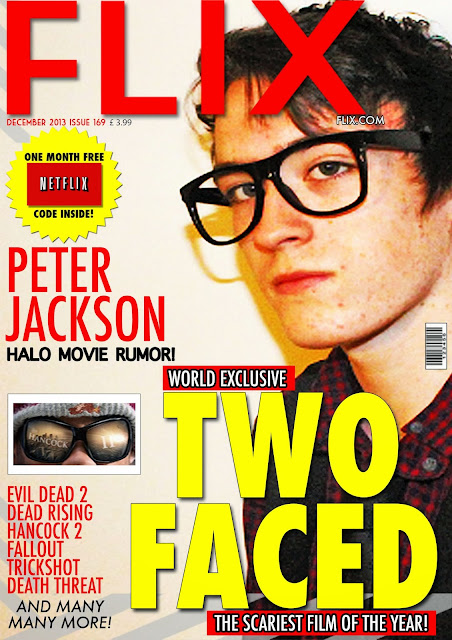
As seen above the two primary examples are professionally done and look appealing to the eye in both positioning and originality.(Below again is the finished product as its the next section of the blog it also gives you an idea of what it looks like compared to others)
The FlIX magazine now finished looks like a common media magazine not in the sense that its bad in the sense that it looks as it should i am happy with the result of this as it was taken from two major magazine titles and then was made off of that.
The positioning of the text is ideal as it dose not have to much text so that it annoys the reader also making the texts vary in sizes shows the most important parts of the magazine off to the reader also making the most important parts the lightest colours on screen grabs the audience towards the magazine.
Furthermore the specific areas in where the text place does its job as a selling point the cost is linked to the title and dose not scare the reader away as it is the thing they notice first rather then last this is a unique selling point as the reader is more interested in whats in the magazine then the price. As so many other magazines do.
The use of a border is effective so that the magazine isn't just a blank image it also takes off space to any areas which are blank are now covered so it makes it look professional this was a technique used by empire magazine.
The use of having a young figure off to the side gives the magazine room to put information into areas it also gives the reader an interest in that this person is a mystery and they are determined to find out what it is this is basic human nature.
Also a young figure appeals to a younger audience which is the main audience i am appealing to the audience being young adults to middle age adults those interested in film more specific.
In conclusion the used of varying text size and a professionally done image of a figure/character make the magazine look genuine. However more could have been done so it looked more like other more recognized magazines and so it didn't look as a common magazine.On the other hand the use of a specific colour scheme and shapes make it stand out to the reader. Out of all of this i can say the work is good but more could be done in my opinion.
Graphics
Sunday 5 January 2014
DVD Sleeve evaluation (TWO FACED)
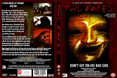
In this blog i will be evaluating the DVD sleeve for the movie Two Faced as seen above i will be talking about key points in the evaluation. I will talk about the production,sources of information,finished product and its effectiveness.
The production of the Two Faced DVD sleeve began with getting the correct dimensions for the DVD sleeve.However a template was used in order to get the correct dimensions with no mistakes once the template was in the correct format the DVD sleeve would be started.
First the previously made Two Faced movie poster was saved as a JPEG file and was then brought over to the blank canvas then it was fitted into place so the resolution was not changed making it look to pix elated.
This was the front cover done as many DVD covers use the poster in order to save production time and to save money so not wait for another design. Next was to do the DVD spine this step was the shortest task to do as it was a basic task. The text tool was used however the text of the movie title had to look the same as that is one of its signature features is the title.
When the correct font was added and the colours and shadowing effects were in place all that was left to do was to rotate the text to face the correct way and cropped to fit the dimensions of the spine when this was done next was to add images. The three images were the official logo of DVD , bbfc eighteen rating and the mask of Two face the first two image were easy to acquire as you can find them on the internet.
However the mask was another matter going back to the mask on its own to do this the original PSD file of the poster was found and most of the layers removed or hidden the file was then save as another JPEG file then cropped to fit the dimensions of the spine similar to that of other objects on the DVD spine.
Now that two-sides of the sleeve were done it was now time for the attention to be turned to the back of the DVD sleeve in which all the information about the movie would be presented. To make a start to the back of the sleeve three white squares were put above one another to indicate where the images would go the on the back. This was to make sure when the text was added it would not clash with the images to make it look unprofessional.
When these indicators were added to the sleeve next was to add the blurb of the DVD sleeve this was a simple anecdote about movie i previously written down before copied and pasted into a text box. However it was structured so certain chunks of text were parts so it wasn't just a big paragraph of text it was split so the reader didn't get bored reading it.
Coming back to the text tool other small pieces of information were added such as the cast and crew and technical information this was cropped and fitted into the areas that it was assigned to, now that all the text was added it was now time to come back to the three vector images these vectors had to be replaced with images of the movie this was done by taking images from three different scenes and then adding them over the white vectors and then adding a red border similar to that of the movie poster.
Finally all that had to be added was images of a bar code and other media related images all of these can be found on the internet these were added and cropped to fit the dimensions of the DVD sleeve.
To make sure the lay out of the DVD sleeve was correct i used information and JPEG images i had seen from previous examples.
Comparing the DVD sleeve that had been made to other DVD sleeves i would say that it looks professional in that .The layout and positioning of text and images is correct to that of other DVD sleeves. As previous examples were used and actual physical copies were at my grasp i was able to get two views of how it would look both on display and digital.
As the image above shows the basic dimensions to that of TWO Faced are the same also the positioning of the text and images match that on both the front cover and the spine. However looking at other examples the back of the DVD sleeve is positioned differently then that of this DVD sleeve.
Linking with the horror-Slasher franchise in which TWO Faced this example is taken directly from that specific genre and is a classic for all horror fans inspiration was taken directly from this DVD sleeve. Using the borders that surround it and how that it is structured this can be show by a side by side view seen below.
As you can see by both images the lay out of them is almost identical however due to a large amount of text the scene images were moved to the right rather then the bottom of the DVD sleeve.
This DVD sleeve mixes in well with the original genre it was intended for which is Horror-Slasher this is shown by the intense images of the serial killer/main antagonist show on the front cover and the back with scenes from the movie.
Furthermore the colour scheme sticking to specific dark colours and light colours such as blacks and reds with the mixture of dark brown makes the poster look more intimidating which makes it look more like a horror movie poster.
In conclusion the use of the positioning of the text and images mixed with the morbid story line and the specific colour scheme makes the DVD look genuine and intended for a specific genre and a specific audience
Wednesday 18 December 2013
Evaluation Movie Poster (Two Faced)
In this blog it will be an evaluation about the Two Faced movie poster and how it relates to the genre and audience in which it was based on using other horror movie posters as a reference.
The movie poster Two Faced is based around the genre of a Slasher Horror movie in which there is one main slasher and often one or none survivors in some cases there is a main protagonist or hero which is this case throws a spanner in the works.
The cover itself relates to they genre as the main villain or killer is seen on the front in plain sight indicating to the audience this is the killer and this is who you should fear and this is who you should watch out for in the movie much like the classic movie poster it shows the audience that he will find his victim and this will be the last sight they will see much like the audience will see him last in each murder scene.
Much like the scream slasher franchise the killers main mask is on display for all the audience to see the picture below shows more clearer.
With the movie poster Two Faced it has a red border this red border represents the bloody part of horror it also brings off the main focus of the mask or the killer to make him appear more intimidating it also links in with dark horror side of the poster as it mixes in with the genre of a classic horror movie.
As seen by the cover above the main antagonist is on the front of the cover and is slightly visible to the audience. However two faced is completely visible like the cover below however it is mainly only the face of the murder so some similarities and differences work together to create the finished product.
The title text for two faced mixes with the genre of the movie as the text is a vibrant red like the blood of his victims furthermore the shape and the style of the text matches the genre as well due to its rough edges and jagged corners it links with the dark genre in which horror is associated with in the modern fashion. Similar to the the examples above each poster has a signature text used this is mainly for the movie title of the film they are quite worn or quite bold. Two Faced has used both of these styles and mixed them and has made them work making the signature text more visible.
The tag line merges with the poster and fits with the genre well as most horror movie posters have a intimidating tagline so does this poster as the tag line is a warning to the audience and mixes with the theme of an intimidating killer in the film.
I found information about horror films from websites but also from my own knowledge and those who appreciate a good horror movie one that visually looks the part so i used other sources such as movie poster images to get the correct feel and look to the horror movie i wanted and then making the poster on from those image segments.
Making the poster started with a basic image of the mask in the most popular cases of horror movie movies with serial killers they seal there identity behind a mask even those of which who don't have a reoccurring series of movies and remakes the mask makes the murderer. However making a basic horror movie plot on why he wears the mask is key so that was done and is found on one of the other blogs i have posted.
The poster started using a basic image of a white theatre mask one happy and one sad these mask where then cropped and cut then merged to make the canvas for the mask to start. using features to lower the brightness and higher the contrast the mask started to take shape. After which using colour balancing and texturing techniques on the poster darken and soften parts of the mask it then became finished and the mask was done.
Making graphics such as the red border was made using the brush tool then adding layer effects to make it look more bold and appealing to the horror audience mainly young adults.
Visually the poster look good now in turn using the text tool to add the title of the movie and the crew information and text line was text this was one of the smaller tasks other then finding the correct movie title font it was a quite basic process.
Finally adding images of company logos of big media industries to the poster was essential to grab the audiences attention for this i used Sony Pictures emblem and then added a BBFC eighteen rating for the movie to make a specific target audience and finally adding a star graphic with the shape tool added five times the product was now finished.
This made the poster look genuine from what i had seen from previous made posters of the horror genre some of which i previously talked about before and some image examples listed above as well.
Wednesday 11 December 2013
Magazine Cover (Flix)
In this blog it will be a window into how i made this magazine cover from scratch with tool used in the program photoshop in the next paragraph below we will begin.
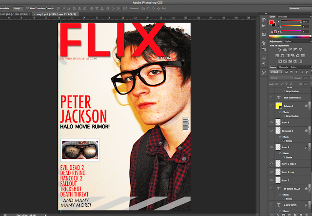
For this magazine cover i started off with a basic image of a friend that i took in front of a white screen and then adjusted the brightness and contrast setting and the shadows and highlight features and then added a sharper filter.
Original Image
Brightness & Contrast
Shadows & Highlights
Final Image
The final image was positioned differently to give the model a more wider appearance rather then just facial features to make the magazine look professional adding a colour balance effect to bring the face out more for the model to seem more vibrant.
Next was to add the title of the magazine to the picture to do this i used the text tool and added the name of the magazine which is called "FLIX" as for the film slang term movie flick.
with adding the text i used the layer style tool and added a drop shadow to the text to make it come off the screen i also made the text red to make it jump out to the viewer.
Below is the title added to the magazine
Next to add was the borders or images around the magazine these were added in different positions on the magazine to give it the intended media feel. what i mean by this is when the movie director says action the striped mark device is used so the stripes represent media.
below is the border result with the image.
Now that the borders were added to the cover it was now time to add more text for example more information about up coming movies to do this again i used the text tool again and wrote tiles for movies that are similar to this one and upcoming made up movies i added these titles in a list format.
below is the added movie titles.
After this text was added it was now time to add information about the magazine such as price,website name ,issue number and sub headline to do this i used the text tool again and changed and varied the colours to compliment the magazine so they appear on screen well and so they can be seen.
Below is the image of more text and information.
The Peter jackson headline would grab the readers attention as he is a huge director in the media industry so i made the text of his article bigger and the headline smaller to give the reader a reason to read this magazine.
Once the text was added i then added two images of importance to the magazine one being a teaser image of an upcoming film the other being a barcode for the magazine so it could be scanned.
The two images below were both used and below them is the magazine used with both images.
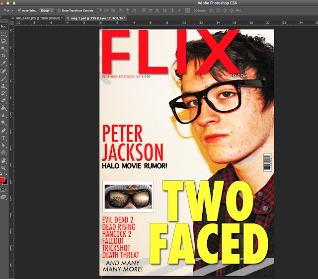
The final things to add was the main attraction of the magazine which is the movie in which the person on the cover is in.
In this case the movie is called Two Faced to make the text stand out i used the text tool and made it bolder and used a more vibrant colour in this case yellow with a stroke effect to make the text stand out more which can be accessed in the layer style options on the layers tab.
To make the title look more realistic i used the shape tool to make two small red rectangles with text inside of them above and below the magazine to make it look more like a magazine below is the finished title.
The one final touch was to add an offer this is seen in pretty much every magazine ever made this is so the reader gets something out of it then just articles they get something out of the magazine this is a marketing technique that always works. To do this i used the shape tool to make a polygon object and then added text inside of it with also a jpeg image of the popular company net flixs below is the final finished product which can be seen also above at the start of this blog.
This is the finished product.
Friday 22 November 2013
Movie Magazine Research
In this blog i am research and looking at the differences between movie magazines and analysing the differences to get a more open view on how the layout is created i will be looking at two different magazines.
in this first magazine i can see that the main actor of the movie is on screen with a smaller image of another featured movie soon to be coming but the main focus is about the movie they are talking about.
Also they have a quote from the movie that they use a s a tag line for advertisement.
It shows other articles which are in the magazine with a list of movies on the side and below the small image above there is the name of the magazine with the website name and the price.
However the barcode is in the bottom right corner. the colour scheme is quite dark on one side but light on the other this is to highlight the main focus of the movie.
In this next magazine the lay out is slightly different for example the title of the magazine is not at the very top instead it is a list of films above there and the title of the magazine its self below the list.
The title is made differently to the other magazine as it just being single image there is text within the image on one of the main vectors. However the movie is highlighted with the larger text at the bottom of the magazine with the main actor in the centre meaning this is the important main article in this magazine.
on the left side of the page there are other articles highlighted. On the other hand there are films listed on the spine of the magazine this is a different to the previous magazine. Further more there are articles listed on the right side other then the left with a small image advertising the next issue of this magazine which also says collect all four mean its a limited issue.
A similarity to the other magazine is that the bar code is on the right side just like the previous magazine.
One final difference is that the main article has a tagline which makes the buyer more eager to read it.
DVD sleeve proposal
for my proposal is that my movie idea Two Faced has a dvd sleeve with information about the movie on the back of it the reason for this is that i believe that it will do well and will mix in with the movie very well in the markets.
I will design the cover the same way i have done the poster with the poster on the front with the same colour scheme for the dvd inlay/sleeve. i will have scenes from the movie and information about the age rating and the technical information located on the back where it is universally placed.
Two Faced DVD Sleeve.
In this blog i am writing about how i made the TWO FACED dvd the time it took in order to get this right and how i did it step by step with evidence from screen shots below this text is the finished project.
To start off this project i had to find the correct dimensions to make a DVD sleeve to this i measured a DVD case to find the dimensions and then used a website to get the template for the DVD sleeve the DVD sleeve website is linked below this text.
With the DVD sleeve template
As show below the correct dimensions for a DVD sleeves is 273mm by 183mm.
Once the dimensions were met it was then time to make a start on the DVD sleeve its self in order to do this i needed to put this template into photoshop simply opening the PDF template and inserting into photoshop was all that was need at this point shown below is the template in photoshop.
Once the template was in photoshop i used the pain bucket tool to fill in the template to make the page white in order to make the template more visible.
when the template was added i cropped the image so only the borders for the template were shown not the out line dimensions.
when this step was done i put the poster that i made previously in the box on the right so it fits to scale with the page.
Once the picture was in the correct position with the correct scale the white borders surrounding it i made them the same colour as the border surrounding the mask to make it blend in a mix in with feel of the movie genre.
As shown above the border ties in with the effect but also makes it obvious that there is still a border there once the dvd sleeve border was finished i then made the white areas back so it ties in with the theme of the original film poster which has a black background to do this i revisited the pain bucket tool and then filled in the areas.
with the areas all filled in was time to turned my attention to the centre of the dvd sleeve.
The spine to do the sleeve i got the original image of the Two face poster on another page and then cropped it so it is visible on the spine.
as shown from the screenshots above the mask is cropped in the spine and fits perfectly once this was finished i moved on to the two face movie text to be located down the spine.
To do this i selected the type tool selected the film font which is called "Crimes Times Six"
below is a screen shot of the text in its default colour.
when the correct text was selected i changed the colour of it to red and then used the edit option to rotate it and scale it to fit down the spine show below is a screenshot of the text on the DVD spine.
All that was left to do on the spine was to have the BBFC 18 rating on the spine and the official DVD symbol to make it realistic and genuine.
i found the digital images on the internet and dragged and dropped them in as they were a PNG format.
Now that the DVD spine was finished it was time to move on to the back of the DVD sleeve.
To start the dvd sleeve off i put a blurb on the back.
To do this i used multiple text layers on the back of the DVD sleeve and then wrote a short summary of the movie with the text layers also with the copy right laws and the duration of the film. with a review from a movie magazine on the top above the blurb.
below shows a group of screen shots showing close up of the different areas of the text.
once all text was put on to the back of the DVD sleeve i had to make this look more real so i added five images two i had previously used these were the BBFC rating the other was the DVD official logo. the other three were a barcode,dolby digital and the sony pictures logo which i previously used on the poster. below are two screenshots of the new images on the back of the sleeve close up and one normal size.
The final thing to add to this DVD sleeve is three images or scenes from the movie on the back simply the original images i had were previously edited and were then put on the back however i put red bloody borders simlar to that of the poster round the scenes to make it seem more appealing to the eye.
i used the previous border i had from the poster and proceeded to put the border around the images i then moved the images to positions one above another until it looked real.
However i felt that it was missing something as the genre I'm going for the horror side of DVD sleeves never have a blank back so i used the mask again but turned the opacity down and hid the mask behind the text.
Below are screenshots of just the scenes and later the mask and below again is the finished product.
So this is my final product i hope this was informative for you and i would like to thank you for taking you time to view this blog.
Subscribe to:
Posts (Atom)