Friday 22 November 2013

Movie Magazine Research

In this blog i am research and looking at the differences between movie magazines and analysing the differences to get a more open view on how the layout is created i will be looking at two different magazines.
in this first magazine i can see that the main actor of the movie is on screen with a smaller image of another featured movie soon to be coming but the main focus is about the movie they are talking about.

Also they have a quote from the movie that they use a s a tag line for advertisement.

It shows other articles which are in the magazine with a list of movies on the side and below the small image above there is the name of the magazine with the website name and the price.

However the barcode is in the bottom right corner. the colour scheme is quite dark on one side but light on the other this is to highlight the main focus of the movie.

In this next magazine the lay out is slightly different for example the title of the magazine is not at the very top instead it is a list of films above there and the title of the magazine its self below the list. 

The title is made differently to the other magazine as it just being single image there is text within the image on one of the main vectors. However the movie is highlighted with the larger text at the bottom of the magazine with the main actor in the centre meaning this is the important main article in this magazine.

on the left side of the page there are other articles highlighted. On the other hand there are films listed on the spine of the magazine this is a different to the previous magazine. Further more there are articles listed on the right side other then the left with a small image advertising the next issue of this magazine which also says collect all four mean its a limited issue.

A similarity to the other magazine is that the bar code is on the right side just like the previous magazine.

One final difference is that the main article has a tagline which makes the buyer more eager to read it.


DVD sleeve proposal

for my proposal is that my movie idea Two Faced has a dvd sleeve with information about the movie on the back of it the reason for this is that i believe that it will do well and will mix in with the movie very well in the markets.

I will design the cover the same way i have done the poster with the poster on the front with the same colour scheme for the dvd inlay/sleeve. i will have scenes from the movie and information about the age rating and the technical information located on the back where it is universally placed.

Two Faced DVD Sleeve.

In this blog i am writing about how i made the TWO FACED dvd the time it took in order to get this right and how i did it step by step with evidence from screen shots below this text is the finished project.


To start off this project i had to find the correct dimensions to make a DVD sleeve to this i measured a DVD case to find the dimensions and then used a website to get the template for the DVD sleeve the DVD sleeve website is linked below this text.
With the DVD sleeve template
As show below the correct dimensions for a DVD sleeves is 273mm by 183mm.

Once the dimensions were met it was then time to make a start on the DVD sleeve its self in order to do this i needed to put this template into photoshop simply opening the PDF template and inserting into photoshop was all that was need at this point shown below is the template in photoshop.


Once the template was in photoshop i used the pain bucket tool to fill in the template to make the page white in order to make the template more visible.


when the template was added i cropped the image so only the borders for the template were shown not the out line dimensions.

when this step was done i put the poster that i made previously in the box on the right so it fits to scale with the page.
Once the picture was in the correct position with the correct scale the white borders surrounding it i made them the same colour as the border surrounding the mask to make it blend in a mix in with feel of the movie genre.

As shown above the border ties in with the effect but also makes it obvious that there is still a border there once the dvd sleeve border was finished i then made the white areas back so it ties in with the theme of the original film poster which has a black background to do this i revisited the pain bucket tool and then filled in the areas.

with the areas all filled in was time to turned my attention  to the centre of the dvd sleeve.
The spine to do the sleeve i got the original image of the Two face poster on another page and then cropped it so it is visible on the spine.


as shown from the screenshots above the mask is cropped in the spine and fits perfectly once this was finished i moved on to the two face movie text to be located down the spine.
To do this i selected the type tool selected the film font which is called "Crimes Times Six"
below is a screen shot of the text in its default colour.
when the correct text was selected i changed the colour of it to red and then used the edit option to rotate it and scale it to fit down the spine show below is a screenshot of the text on the DVD spine.

All that was left to do on the spine was to have the BBFC 18 rating on the spine and the official DVD symbol to make it realistic and genuine.
i found the digital images on the internet and dragged and dropped them in as they were a PNG format.

Now that the DVD spine was finished it was time to move on to the back of the DVD sleeve.
 To start the dvd sleeve off i put a blurb on the back.
 To do this i used multiple text layers on the back of the DVD sleeve and then wrote a short summary of the movie with the text layers also with the copy right laws and the duration of the film. with a review from a movie magazine on the top above the blurb.
below shows a group of screen shots showing close up of the different areas of the text.


once all text was put on to the back of the DVD sleeve i had to make this look more real so i added five images two i had previously used these were the BBFC rating the other was the DVD official logo. the other three were a barcode,dolby digital and the sony pictures logo which i previously used on the poster. below are two screenshots of the new images on the back of the sleeve close up and one normal size.


The final thing to add to this DVD sleeve is  three images or scenes from the movie on the back simply the original images i had were previously edited and were then put on the back however i put red bloody borders simlar to that of the poster round the scenes to make it seem more appealing to the eye.

i used the previous border i had from the poster and proceeded to put the border around the images i then moved the images to positions one above another until it looked real.

However i felt that it was missing something as the genre I'm going for the horror side of DVD sleeves never have a blank back so i used the mask again but turned the opacity down and hid the mask behind the text.

Below are screenshots of just the scenes and later the mask and below again is the finished product.


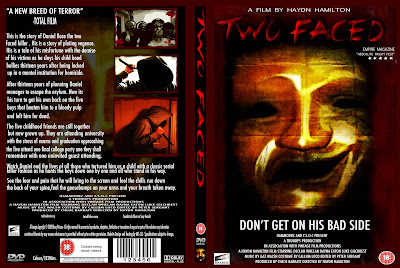
So this is my final product i hope this was informative for you and i would like to thank you for taking you time to view this blog.

Friday 8 November 2013

Two Faced (My Movie Poster)

The image below is the finished product of my movie poster and original slasher movie for a horror genre type film in this blog i am going to explain the idea of the movie and the process in making it.


The film is based around a new serial killer who has escaped from an asylum and is taking his revenge on child hood bullies thirteen years later.
The film is called Two Faced because of a main story line about his split personality and how he was treated by everyone he also wears two masks showing his emotion at the time he slashes his victims.

Process
Firstly i needed raw photos to use to make the project work linking with the theme so the first pictures i took were of theatre masks both happy and sad along with some textures there wasn't a lot of photos due to such a simple complex for the poster.
Below are the photos used.
When these photos were taken i made a start to the poster firstly the masks had to be cropped so they were cut in half on one side so later they would come together as a single mask once this was done i used the colour balance option to make the mask a dark brown before this i put the masks together and saved it as a JPEG file so not lose the mask and a PSD file would have layers which later on would be more trouble to use.
Below is the process on making the mask

Once the mask was finished it was time to texture the mask with the photos that i provided before to do this i used a featuring called masking in which you get a colour or an image and make one layer overlay the other one to make something called a mask or a texture to give the mask a lot more life to it to make it look more realistic and to keep with the theme of the genre below is the work of texturing the mask also the finished product.
once all the texturing was done and playing around with the brightness and contrast and the colour balance for the textures also adding a shadow to the mask. it left the picture looking empty which is shown below.

the mask is dead centre but around it there is space so i created a red border around the mask to do this i opened a transparent background then used the paint tool to draw red border to symbolise blood and death to tie in with the theme of horror.


when this border was i made i over laid the border then used the FX options to make the border darker and also added a bevel to it to make it look more menacing to mix with the film genre below is the border postponed around the mask before adding the text and the icons.


Now that the features have were created it was time to focus on the title and the information for the poster first the title. For the movie title i used a font found on DAfonts called "Crimes times six"the text below shows what the text looks like.
below is what the poster looks like when the title text has been added,coloured and has FX put together.

The final task is to add normal text and information about the movie to the poster this was the easier task of the others all i needed was the type tool and some images of the BBFC rating and a film company once this was added to the poster it was finally finished the final product is shown above and below the blog. the stars were vector images that i found on the photoshop shape tool.

That is how the two faced poster was made the process was a long process but the final result was worth it.

Wednesday 6 November 2013

DVD Sleeves Research

The following five movie DVD sleeves i have selected have some similarities and difference in this blog i will be identifying these and writing a description of each one.

Don't Let Him In 

In this first sleeve the front cover shows the tittle of the movie below that is a small tag line and further down is the crew and actors finally at the bottom it shows BBFC rating the official DVD logo and the company who made this movie. The content dose not show any seriously well know actors or any signs of awards. the colour scheme is dark with the light source being in the centre of the cover itself.

On the spine of the sleeve there is the title of the film with a picture of one of the characters faded and darkened below all this is the official DVD logo making it a legit copy.

Located on the back there is a movie quote of the film located at the very top this gives a tease effect to the reader giving them information about the potential plot of the movie its to ease the reader to keep reading and positioned below is the blurb of the movie telling the customer more about the movie. The blurb has been made to fit as to the right of the blurb is a picture of the character that we can see on spine with the title of the film below him. Underneath this is scenes of the movie giving the audience a small gap into the movie and below is all the technical information.

This film looks to be presented to those of a horror liking nature more into this type of movie however the film is not dark in the sense of it being an adult movie meaning that it is alright for teenagers to watch.sixteen year olds and older

The film uses dark colours to illustrate the genre of the movie to the audience it  makes obvious to customer looking that it is a dark movie meaning it is either a horror or that it is not a family friendly movie.


Terminator: The Sarah Connor Chronicles

This dvd sleeve has small similarities to that of the last one we saw the colour scheme on one side is dark however the front part is completely visible where as behind it is darker. The front is visible with two of the main characters on screen positioned facing separate ways this can give off that its a drama on the other hand with the positioning of the female character she has a shot gun in hand this can also give off that its an action mixed with drama.

A difference is that there is no information about the director or the actors on the front and there is no information about the age rating on this product. However all this information is located on the back at the bottom. Furthermore a big difference is that this DVD sleeve has more then one disk this is explained above in the top right. A similarity to the last sleeve is that there are images of the characters and the scenes located on the back along with the blurb.

The audience is focused more on a younger group of people as the characters are all of a young age however with this being a series dedicated to a well know movie series the original movie audience will also be a in how this links in with the movie.

The spine is the same as the previous one.
The film company the name and the bbfc rating is located on the spine.


Halloween

The DVD sleeve below has similarities to the Terminator sleeve as on the front of the case there is no information detailing the age of consent/BBFC rating or no information about the actors and the director or the crew. It is just the character of the movie with the title and a tag line. The tagline is only visible at the front rather then the back which we have seen in the previous sleeves.

The cloud scheme is similar to Don't Let Him In dark colours however the character is show twice once as a full shot and the background is his face with dark and light colours mixing. also the main image is surrounded by a boarded to make more visible.

The spine is the same as the previous two the same layout.

Located on the back is the name of the film title similar to the previous two below is the blurb however this time the images have been edited to fit in rather then the blurb being change to fit and image. below the blurb there are scenes of the movie in borders. below there is technical information and information about the people who made the movie.

The movie has similarities to that of Don't Let Him In with the colours making it seem more darker this linking to people who are interested in this type of genre however there is an age gate for this movie also similar to terminator with this movie being a remake the audience would be a wider range as this is a classic film so people of an older generation and a younger generation can both see this movie varying on opinions about the film.