Here is the example photo: (Unedited)

1.Brightness & Contrast
The first thing i will be changing in this photo is the brightness and contrast witch can be found by going to Image>Adjustments>Brightness & Contrast.

As you can see below the brightness and contrast option has come up next to the side of the photo to change the settings of the brightness and contrast simply move the sliders from one side to another.

This is a close up of the sliders have preview selected so you can see the effect of the changes in actual time so you don't have to repeat these steps again.

As you can see by the sliders below i have changed the settings to brightness 64 and contrast 56 with preview selected.

below is the result due to the changes in brightness and contrast.

As you can see the photo has become more bright and looks more appealing due to its radiance of the photo and how it comes off the screen to the eyes of the viewer.
2.Lighting Effects
The original photo is lacking something called lighting effects what i mean by this is that it casts a shadow but is very faint and dose not look that impressive.
Using a lighting effect filter will bright a sense of light direction to the photo and cast artificial light which will make the photo look more eye catching due to the direction of the light.
To get to this option simply go to Filter>Render>Lighting Effects.

As you can see below the photo has become black but has a small ball of light pointing in the opposite direction in where we want it to go.

Do not worry though as the dots indicated around the oval shape rotate and expand the light so we can point it in the direction we want it to go.

As you can see the light is now facing the way i would like it to go but the photo is still to dark to change the radius of the light in this photo simply go to the circle in the center with the white circular bar and move the white bar around or use the options to the right of you.

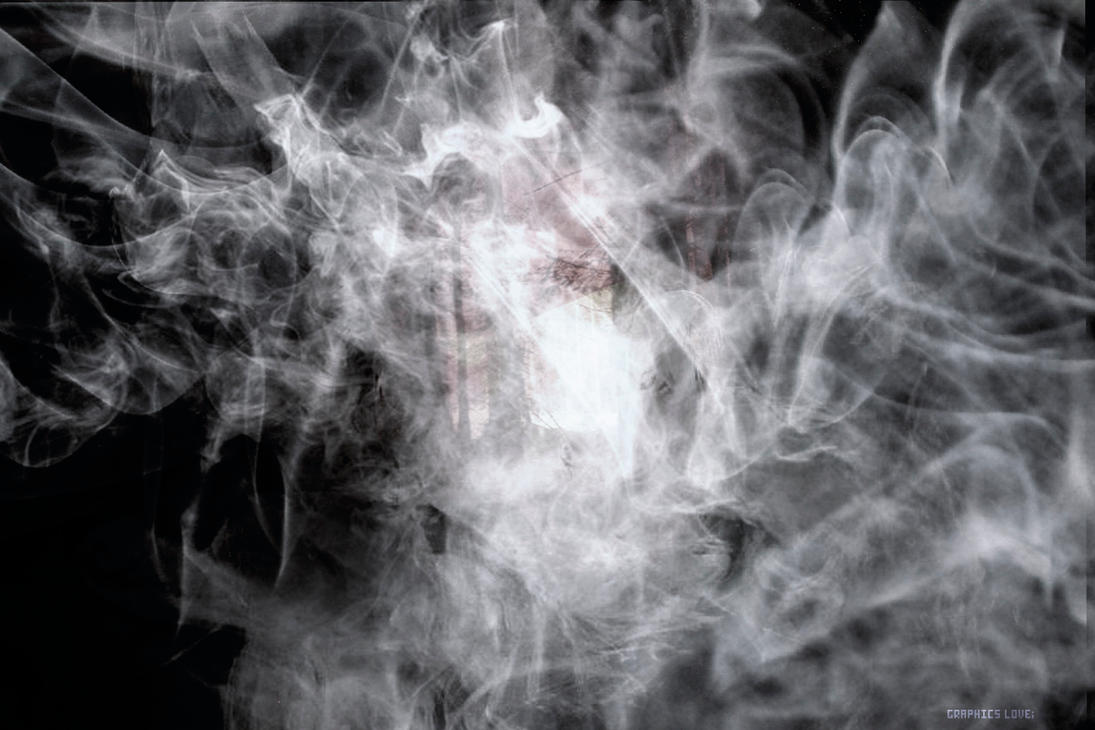
As you can see due to the direction of the light it gives it more ambiance to the photo as it shows the direction of the lighting it gives the model more of an appearance as the background fades away in the back making you focus only on the model.
3.Desaturation
Desaturation is a basic option that can be accessed in two ways all this changes is that it takes all the colours away from the photo to leave it as a black and white photo a quick short cut so you don't have to use more complicated options.
To simply change the photo to black and white use
CMD+Shift+U if your on a mac
CTRL+Shift+u Windows
This will change the photo to black and white the quickest way.
The other option is
Image>Adjustments>Desaturate

Below is the desaturated image.

4.Hue & Saturation
To make your photo look funny or odd using this tool can help as you are apple to completely be change the colour to something completely ridiculous.
For example in the movie "Avatar" the aliens are blue so i will be making this character blue by using Hue & Saturation.
This option can be found by going to Image>Adjustments>Hue & Saturation.

When you have selected this option three sliders will appear we will use only two the lightness one does not really matter as we are not focusing on this.
I change the sliders to +180 and +20 this made my character turn blue below this image will show the character as a blue character.


5.Overlay Images
This technique is a very helpful one if you want to bring out your photos or to use depth or texturing in the photo to make them have a feel or theme to them what this means is putting photos on top of one another to create a better impression.
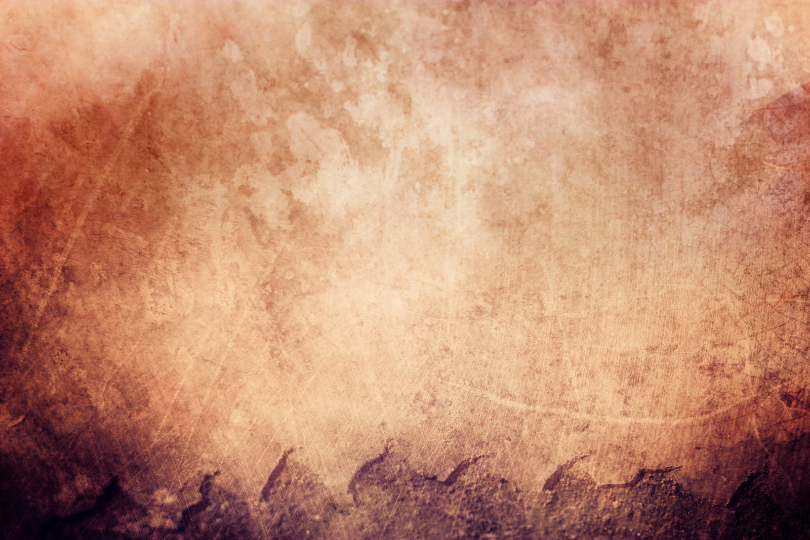
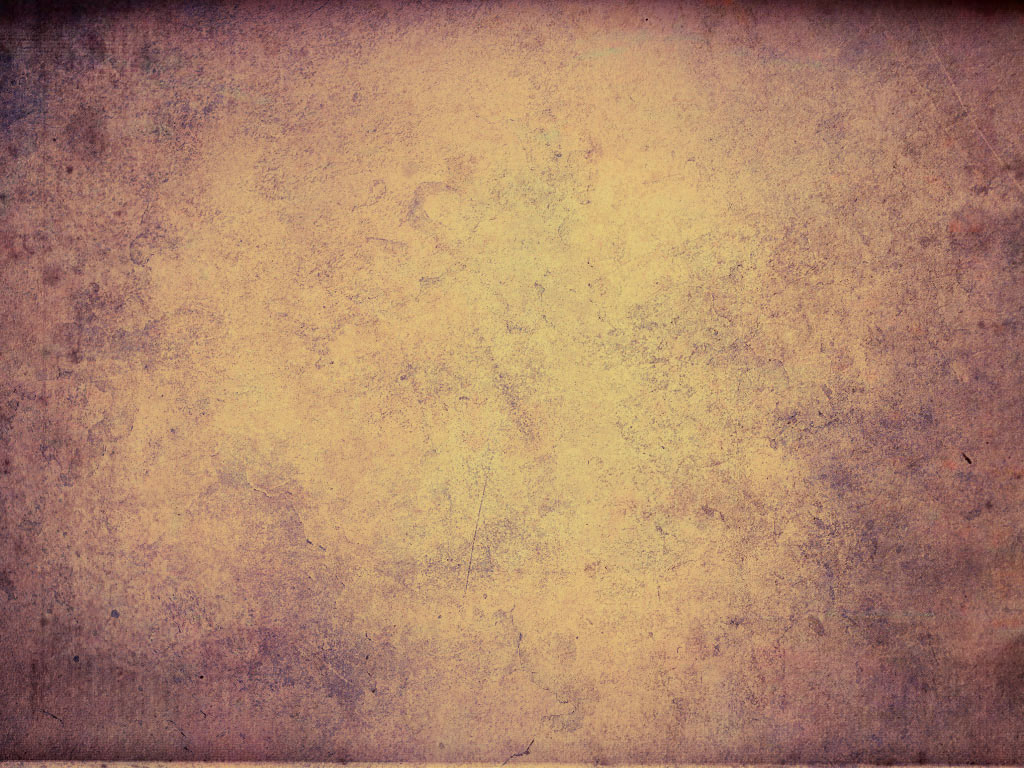
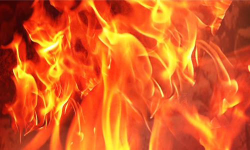
I will use the following photos below.


To overlay images open the photos in separate tabs drag them over and put them on top of the photo like show shown below.

On the right side there is an option that says "Normal" click on this and select "Overlay".


You can change the mode to what you desire to see what you think will look good below shows the finished product with the three photos.

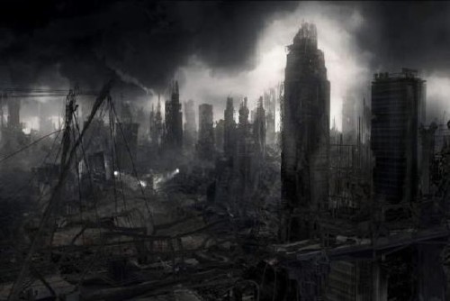
As you can see it makes the photo appear different it can also link to a theme and will make it look old or like it is on a piece of paper this can be done in many different ways such as some other examples i have done below.


All photos above have been done by using this technique.
6. 3D TEXT
In this step i will teach you something different i will teach you how to make eye catching 3D text i will not be using the model photo i will simply type a word and make the text appear 3D.
Using the text tool on the left.

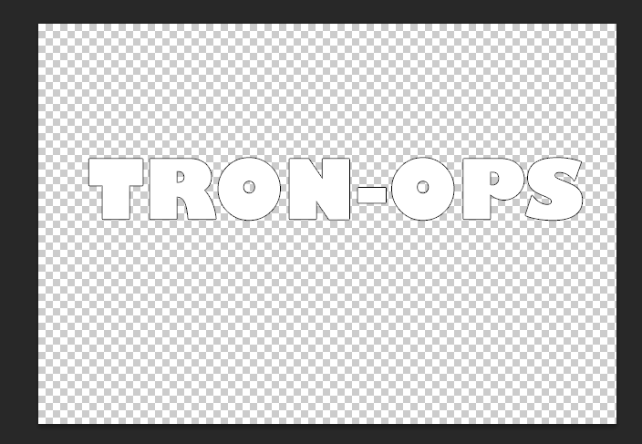
I will type the word of a youtube channel i watch Called Tron-ops
I typed the word but it wasn't visible as the text was white on a clear background.
I added a stroke effect/outline to do this i went to Layer>Layer Style>Stroke

This is what the text looks like so far.
As you can see very basic next we want to convert this into a shape to do this go to Type>Convert Shape.

Now that this step is done we want to change the perspective of the text so we can see the 3D coming off it to do this go to Edit>Transform>Perspective.

Once you have done this a box with markers will appear around it like so.

Drag the bottom right box in a downward direction this will then give the text depth which is what we are trying to create.

As you can see the text has no created a window into where we can imagine where the text will become 3D.
Next we are going to create the illusion of 3D simply get the "Move Tool" and hold ALT and move the text to the side keep doing this as it will copy the text layer multiple times. please turn the stroke effect off before doing this as it brings the illusion out more.

As the photos shows we are starting to get the whole 3D effect.
next find the first layer that was created on the layers tab and pull it towards the top.

Every other layer can be left where it is as they will be used in a moment.
Once that layer is at the top select all other layers apart from the original to do this click the bottom layer hold "Shift" and click the 2nd layer below the original layer then right click and select merge layers or create smart object.
Now that this is done click on the merged layer and go to layer style as we did before but click on gradient overlay.
Select the black and white gradient leave the the settings as they are unless you want to alter them to make it look different below is something like what you should have.

7.Invert
A very simple photoshop technique is using the invert function this unlike saturation.
Inverts the colours you currently have to simply do this you either use
Ctrl+I
or
CMD+I
In doing that your photo will look this.

8.Rain Effect
In this section i will show you how to make a rain effect in photo shop for this you will need the photo you are working with and a picture of water droplets such as the one below.

Drag the water droplets on top of the photo you are working with and keep it there for the time being.
Click on Filter>Blur>Motion Blur
Put the sliders to about minus fifty four then change the angle so you can put the rain in the direction you want it to be press OK.
Then overlay the image with any desired option i picked multiply and then played with the opacity factor and this is the result of a basic rain effect below the example is a piece of finished work i previously did before this.


9.Magnetic Lasso Tool
The ninth thing i will show you is using the magnetic lasso tool it is located third from the top hold down and click it on the side.

Watch this tool does is that you are able to trace around a picture and then cant move this section and put it elsewhere quite basic but if you want it to look perfect it is very time consuming.
The dotted lines indicate the area you have traced you can now move the item freely the next image below is the something i did with this model in full scale on a background i previously created all done using this technique.

10.Fade Out Effect
In this final example i will be using a different photo a photo of project almost finished all i need to do is fade out the photo now i could this by using the overlay feature and changing the opacity.
However what i am going to do is use the eraser tool and change the opacity of that and then use a smooth brush this will create a fade effect as i will show by the three photos below.
No Fade:

Slight Fade:

Full Fade:

As you can see the photo starts to fade into the background giving it a more atmospheric touch up to the image it also brings it closer to the colour palette and links with the theme of the photo very well.
I hope what you have read has been informative for you and that this can help you in the future with your Photoshop experience.
Thank you very much for reading