Wednesday, 2 October 2013

The Expendables 3 Poster

The process for making this movie poster started when a select few students were put into different positions and given props in front of a green screen. we then added light sources to either the left or the right side of the individuals body to make one side dark and the other side lighter. The photos were a jpeg file format which you mainly find on cameras and is a good quality format to use for live action posters.


After the pictures were taken and uploaded i put these photos into photoshop i then started to cut around the students using the magnetic lasso tool. i did want to use magic wand tool and the select
colour feature however it did not give a satisfy result so i kept using the magnetic lasso tool. when the students were cut out i dragged and dropped all 10 students into a a big enough canvas for them all to fit into the frame.


After all 10 students were put into the photo i set each students brightness and contrast to a rate that matched so the poster would not look its best. i then change the size of the students having one student in the centre and having the rest at the sides gradually getting smaller and smaller. i then zoomed in with the magnifying glass and used the eraser tool to get rid of any ruff edges or used the blur tool for the edges that were not big enough to delete.

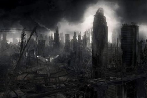
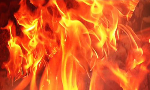
when the students were in the right position i then found a background image of a destroyed city and made this layer the bottom layer so it took over the blank white background. i cropped it into a size that fits into the image border.i then used the internet to get images of textured photos.


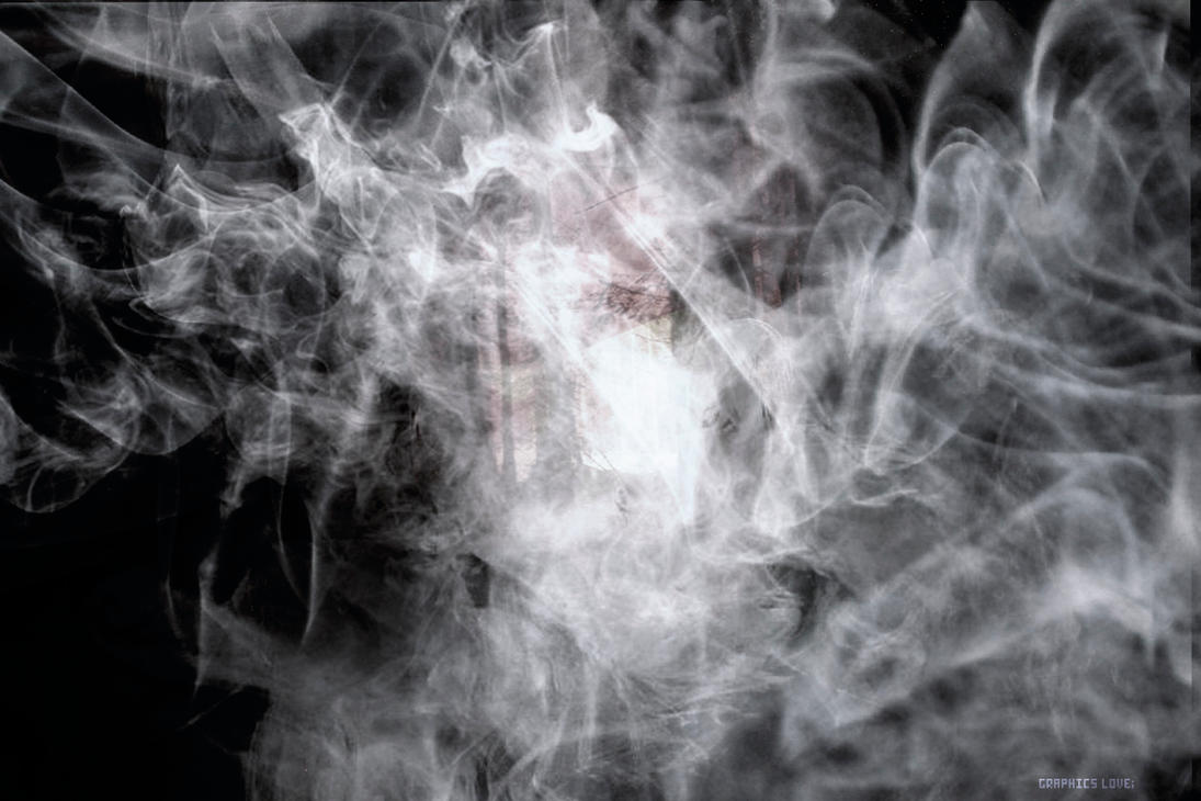
When these were downloaded i dragged and dropped these photos on top of the photo of the students and changed the layer setting to either soft light or overlay. when i was happy with the way the photos were arranged i darkened and lightened some of the textures and add filters once this was done i moved onto finding a font for the poster.

I went onto a font website called DAfonts.com and found a text called Broken Detroit.
http://www.dafont.com/broken-detroit.font


Once i found a text that suited the genre of the film i added this text to the poster and use this text as the main title text for the posters. when this text was in the correct place the "Layers" tab was selected then "Layer Style".  on the layer style options i selected a "Stroke" option which made a black out line round the text when this option was implemented the colour text was changed to white to make the text more visible and also more eye catching. With some text i used the opacity option i faded the text to make the poster more like its the original theme.

when all of the main editing was done for this poster it was time to make the poster seem more realistic to do this i used the internet to get the age certificate from the bbfc.

http://images2.wikia.nocookie.net/__cb20100225224907/gtawiki/images/5/5a/BBFC_18.png

Afterwards i was provided with a blurb for the poster where certain text should go on the posters such as directors names,tag lines,cast,crew and company who fund this movie. once all this text was written on and visible the final thing was to add the company logo of a famous movie company i used Paramount Pictures.

http://www.scifinow.co.uk/wp-content/uploads/2010/03/Paramount+logo.jpg

Movie Posters


Genre: Horror -Slasher

The dark colour scheme and effects of a fog over a dark figure indicate the genre to be a dark horror movie. However with the appearance of a classic psychopathic killer with a machete and a hockey mask and the zombie like stance show it’s your typical classic slasher film.

The style of the text being bold and all caps makes it an impact to your eyes and with the text having cracks and stains have a dark swampy feel. With the red text indicates terror and blood which is the main features of a horror film which slasher fans look for the most.

Below the text indicates another film similar to this one with it being made by the same company shows that it will live up to its name as a horror movie to the audience.

The list of cast in this film show it is independently made it does not have A-list celebrities in it which shows that it’s not been tampered with and its quality will be more realistic to it not having well known celebrities involved.

However “Jared Padaleki” is a well know actor for supernatural which is a horror basted series with many different types of horror. He will be the only actor in it with a high knowledge of the horror franchise and people will know this if they like the genre of this movie and the TV that he is a main star in.


Genre: Action

The actors in this movie are well known actors in the movie franchise which shows to the audience that this movie has a lot of potential and good quality acting which will make the move to a memorable experience.

The effects on the poster showing debris from an explosion indicate the movie is an action packed movie with a lot to look forward also with a bazooka and other guns show there will be pursuits and violence which people who prefer this genre love to see.

The text on the poster is very elegant and well positioned which shows there will be some smart thought put into the move and maybe twist and plots that are unseen and it makes the movie look different to what you usually see in action movie. 

Also the movie is linked to another movie which the director of this movie made which was very successful and similar which makes this worth watching.


Genre: Horror -Slasher

The dark colours and use of lighting in this poster has a creepy effect as the light is being directed down to the tools that the murderer uses which makes the audience have a window to see just what there in for.

Looking at the objects and tools used in this image it shows just looking that this movie is very dark and links to the genre perfectly as it shows the audience whats coming what to expect and whats going to happen. 

Looking further at the text it looks worn and stretched and has a sort of skin texture which links to the tag line "Evil wears many faces" this gives the viewer the effect that this "Slasher" has a sick ritual involving other peoples and there skins more importantly there faces this could show a story line of a child deformity.

This poster is a teaser poster as it shows no actor or any sort of information about the company who made the movie or anything along those lines this gets the audience more hyped up for the movie by simply giving them a release date this will give the audience a movie to look forward to if they link themselves with liking these sort of movies.

The audience for this poster would be 18 and over its more linked to adults maybe not those of elderly age as it looks very violent and graphic so this would be suited to a younger adult audience from 18 and up the audience who watch this would have to have a very strong open mind and very strong heart.


Friday, 27 September 2013

Genre Fonts

Horror
This font works as a horror text because the crocked and jagged edges work as the text looks scratched on to a rough surface. it also shows a sense of pain scratches,cuts and drips shows that the potential horror movie would more then likely be a slasher horror movie and looking at the font it would be a more sinister movie for and older age group. On the other hand it looks more chaotic it seems a sort of horror judgment movie related. more satanic and ritual based some sort of occult font similar to a religious believes similar to movies like the exorcist.

Sci-fi
The following font above works in a sic-fi genre as the shape of the text looks blocky and very stern.However looking more closely at the style of the font with the small paint splatters indicates a  the genre mixes in with action. With the text being blocky it shows that the text would be in a movie similar to Alien & Terminator a movie based on a group of protagonists fighting a losing battle against impossible odds.

Romance
The font above relates to the romance genre as it obviously has indications of love as there are hearts located all around the text. However looking further it looks more as a teenage style a more youthful text for the more younger audience. looking more closer this text would more then likely be used in diaries of teenage girls and may or may not be used in a romance program drama or something similar.
The look of the text looks drawn on a sort of doodle you would find in a teenage girls diary or on the front of a text book of either a teenage girl or a girl who is developing in to a teenager.

Historical Drama
This final font is best suited in the historical drama genre just by looking at the text its self  you can see that the text is relatively old maybe 16th century. looking further it looks like it would be used to advertise plays or great working of William Shakespeare or those of similar lines of works. However looking at it from another perspective it looks royal something the royal family would be related to. The reason it looks dramatic is because in 16th century books and plays this text or a similar font was always used or similar so over the course of centuries this font has adapted a reputation for being used in historical dramas.

Friday, 4 January 2013

Vector VS Bitmap

In this section of the blog i will be talking about two different file formats and the pros and cons of each file type and how each of these file type is used within certain photo editing software such as Adobe Photoshop and Adobe illustrator.

Bitmap is a file that is used mainly for photos this makes pictures look crisp and original which makes them more presentable in certain parts of the media industry such as posters and billboard advertisement .

However if you change the aspect ratio of the photo it will make it look stretched and less professional as this image realise on pixels. If you stretch and altar the size of the image along with the chaining the resolution you will able to see pixels making the image look terrible for use.

With bitmap depending on the size of the image it only allows you to change the aspect ratio so far as the pixels are a certain size. This file type along with JPEG is used in photoshop for photographers as it makes the image look more original and realistic as apposed to an illustration or graphic for commercial use.

Vector is an image format used mainly for commercial use in such products as children's books and posters. The difference between a bitmap and a vector is that vectors are illurstrated shapes that can be altered and not worry about the pixels as vector images can be altered to a massive scale and will still stay the same resolution.

However vector images are quite low quality images meaning that they are often used as small images with a basic colour.

The type tool in both photoshop and illustrator is a vector tool as you can stretch and alter the text with out the worry of it becoming pixelated as the text is a vector image and can be altered in many ways.

However vectors being a basic image or font don't look as appealing to and older age group therefore they are best suited to a younger audience with products such as children's books and cartoon shows.

Thursday, 3 January 2013

Adobe illustrator VS Adobe Photoshop

In this blog i will be comparing the differences between adobe photoshop and illustrator and what file formats are best used for each programs and which program is best used for.

Adobe Photoshop is a photo editing software used widely in all parts of media and is probably the most know and is the best program you can get to edit photos with.

Mainly used in photography and advertisements such as modelling and products it is nothing but amazing in what is possible in this software. Jpeg and Bitmap images are the two best formats for this program as it realises more on actual images other vector graphics and effects images more as the name dictates it is used mainly on photos are a priority as the program is created for editing actual photos and not images created as a graphic.

Illustrator is mainly used as a software for creating images from raw canvass or files mainly used to make graphics and drawings.

Furthermore illustrator as the name dictates it is used to illustrate images to create vectors meaning this images are mainly used as pictures in a certain section of the media industry mainly advertisement of products as they are basic images and are single created shapes these vectors and be scaled and stretched  with out the risk of pixelation making it easier to create a finished illustrated product. However the quality of the images don't have such a high resolution to that as a professional photograph.

in conclusion photoshop is mainly better for editing actual photos where as illustrator is better used for creating vector graphics and images from scratch even though the quality isn't as impressive as a professional images. Vector graphics are better used for simple advertisement tools.